Introduction
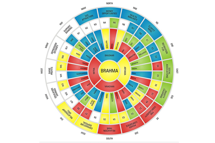
In Vastu Shastra, colours and directions are closely connected to the five elements—Earth, Water, Fire, Air, and Space. Every direction is ruled by a specific planetary energy and element. When suitable colours are used according to direction, they enhance positivity, harmony, and prosperity in the home or workplace.
Incorrect colour selection can disturb energy balance, while proper colour alignment strengthens health, relationships, finances, and mental peace.
North Direction – Wealth and Career Growth
The North direction is associated with financial growth and career opportunities. It is linked with water energy and is considered highly auspicious for business and cash flow. Light, soothing colours enhance clarity and attract prosperity.
Using appropriate shades in the North direction strengthens financial stability and professional success.
- Use light green
- Use pista green
- Light blue shades are suitable
- Avoid dark red or black
- Keep the area clean and clutter-free
East Direction – Health and New Opportunities
The East direction represents sunrise, growth, and new beginnings. It governs health, social reputation, and positivity. Soft and refreshing colours improve vitality and mental freshness.
Balanced colours in the East help maintain physical strength and bring new opportunities in life.
- Use white
- Use light yellow
- Light green works well
- Avoid dark grey shades
South Direction – Strength and Fame
The South direction is connected with power, confidence, and recognition. It is influenced by the fire element. Strong and warm colours can be used carefully here to maintain balance.
Proper colour selection in the South ensures stability and supports leadership qualities.
- Use light red
- Use pink shades
- Peach colour is suitable
- Avoid blue tones
West Direction – Stability and Gains
The West direction relates to gains, stability, and support systems. It is often associated with material success and social support. Neutral and earthy tones work best in this direction.
Balanced colours in the West maintain financial growth and emotional stability.
- Use cream
- Use beige
- Light grey is suitable
- Avoid excessive dark shades
North-East Direction – Spiritual Growth
The North-East is the most sacred direction in Vastu. It represents wisdom, spirituality, and divine blessings. Light and pure colours enhance peace and spiritual energy.
Keeping this direction light and calm attracts positivity and harmony in the home.
- Use white
- Use light yellow
- Use light blue
- Avoid dark or heavy colours
South-West Direction – Stability and Security
The South-West direction provides stability, strength, and long-term security. It is ideal for the master bedroom and heavy structures. Earthy and deeper tones bring grounding energy.
Using correct colours here ensures strong relationships and financial stability.
- Use mustard
- Use earthy shades
- Use brown tones
- Avoid green in excess